Design:
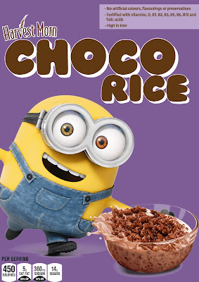
As I wanted to take forward the idea of using a character to influence consumers to buy the product, I have created a design with that being the prime focus.
The brand that I want to create would be:
- Targeting children 5 - 14 years old
- Be friendly and engaging
This is the current cereal box design which mimics Kellogg's Coco Pops, it does have a childish feel to it, but I don't think that it stands out well enough on a shelf.
Experimentation:
Colour -
YELLOW: From my research into colour associations for children I found that brighter shades of yellow can stimulate the memory and increase metabolism. This is good because children will remember the box well and want their parents to buy it for them as well as increasing metabolism. The yellow and brown also works well as it produces high contrast making it stand out a lot more. The problem with yellow is that the minion might blend in a little too much with the background. I also wanted it to move away from the same colours as the previous box.
PURPLE:
This will associate the brand with a more upmarket, luxurious feel. Purple also has a high contrast with yellow, the minion being yellow, it provides a really engaging design that catches your attention and will help stand out amongst the other brightly coloured boxes. For the text I have chosen to go with a dark brown to help better emphasise the chocolate inside and provide a better harmony with the purple. The white outline on the title helps to give a higher contrast and make the text really stand out.
Images / Character:
I have made the images on the box the main focus as children are more drawn to images than text. Because of the scale of the character it will easily be recognised from a distance and will be able to catch attention more easily. The use of a recognisable character also makes the brand seem less cheap as it is associated with such a well established children's character.
I tested out using a Kung Fu Panda character as apposed to a Minion but compositionally it doesn't seem to work as well. The colours also don't contrast as strongly, so I am going to keep the Minion.
Typeface:
akaDylan Open - I like the playfulness of this typeface and the 3D effect that it gives to really stand out. The bowls are also not central which provides an interesting design.
Blessings through Raindrops - I like the handwritten effect this typeface has which gives a more personal feel that makes it seem more friendly. However, I don't think this typeface is bold enough to stand out on the box to really catch attention.
Title - JI Chunky Caps Regular - I chose this typeface because I thought that it would appeal to children, as bubble writing is a nice friendly rounded style. The 3D style helps to make it stand out and catch the eye. The X-height of all the characters is the same which gives and ordered and compact feel.
Nutritional info - Kohinoor Bangla Bold - This typeface is legible and has an informative feel to it. The nutritional information is to appeal to parents so I have kept the typeface simple and less stylised as it is giving important information.


No comments:
Post a Comment