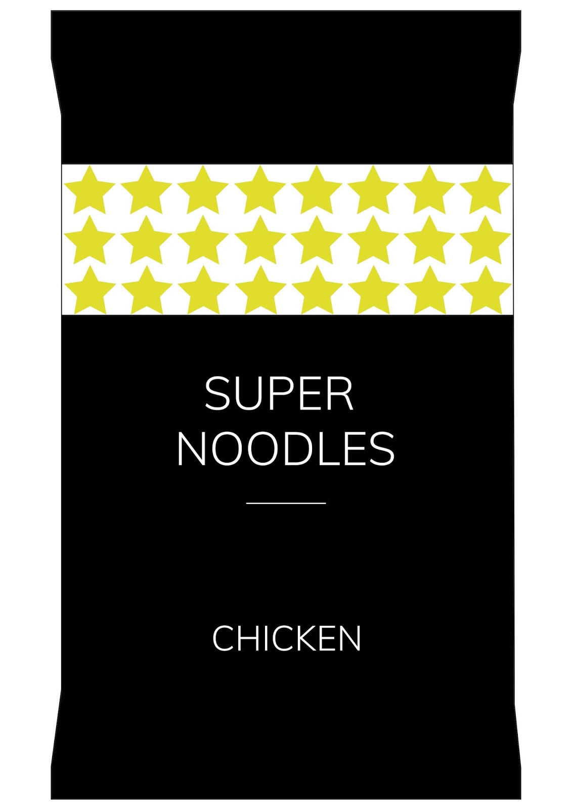
For my third design I am going to work with a pattern of stars, in a strip at the top of the packet. Text will be organised centrally underneath.
Gill Sans Light:

Avenir Light:

Muli Light:
Helvetica Light:

Amiko:

Gaining some quick feedback it was suggested to choose a typeface that is similar to the ones used in the previous design. As it was felt that Amiko doesn't have such an expensive feel. They also felt that the white background didn't work and made it look too cheap. So it was suggested to remove the white background and only have one line of stars. I made these changes and it has improved the overall design to appear more high end.

Explanation/Justification:
The minimal design is clear and the layout is organised which provides a more high-end design. The strip of stars hints at the quality of the product without appearing tacky. The consistent thin stroke width makes the type appear elegant and classic. The logo again is kept in greyscale so that the red does not draw attention away from the main design.
Feedback:
- Colour choice works to give off luxury appeal
- Too much black, would be lost on a shop shelf
- Introduce more colour
- Simple layout reflects luxury approach
I don't think I am going to take this design forward as I feel like it is too plain and basic, it isn't engaging enough, and would not stand out on a shelf.
No comments:
Post a Comment