Evaluation:
Within the COP 3 module I was interested to explore how design effects peoples behaviour through persuasive methods. My aims were to understand how it is used and what techniques and methods are implemented to try and influence consumer behaviours. I also wanted to understand why these things work, as I explored the psychology behind the methods. Through the research I conducted for my essay I gained much more of an understanding and it has highlighted the strong link design has with psychology. I also began to realise what effects on society persuasive methods were having, which can be detrimental to physical and psychological health. This is why within the practical outcome I felt that it was important to highlight and raise awareness for the possible issues that could arise from advertising. The project overall has helped me to become aware of the influential power that designers have and how we can use that within society positively. The practical aimed to draw more attention and develop a further understanding of the negative impact of advertising on society. With the knowledge I had gained from the essay, how I could best drive awareness and persuade people to take notice and action against these damaging methods of persuasion.
I wanted the practical to be humorous and ironic, using ads against ads to highlight what they are really doing and at what cost to society. Doing further research in to 'Adbusters' and 'Subvertisements' really helped to inspire my practical outcome. Overall I feel that the practical outcome achieved its aims, it drives awareness with a clear message and the campaign should spark conversation through social media. The use of symbols, humour and the share-ability of the campaign should appeal to the target audience. I did find the practical outcome challenging as I wanted to come up with a really strong and humorous concept. But, I do believe I have tackled the outcome in a different and interesting way that uses the psychology researched within the essay. I think that the outcome could be further developed to create a really strong campaign, such as creating more of a pack for the stickers and how it would be mailed out and with what information. Creating more of a presence online would also help to further expand the reach of the campaign.
My essay acts as more of a discussion rather than an argument and its aim was to explore methods of persuasion and I think that it has achieved this. As it is such a broad subject more in depth analysis of persuasive methods could be done to determine the effectiveness of persuasive communication. The practical outcome uses what I have explored and learnt from the essay to positively have an effect on society.
Overall this module has been tough, it has pushed me to research, reflect critically and implement what I have learnt into a practical outcome. I have enjoyed doing the research and I am proud of what I have written for the essay. Together the practical and essay support each other in understanding how persuasion works, with what methods and to what effect.
Sunday, January 21, 2018
OUGD601 Practical Rationale
Practical Rationale:
WHAT
A guerrilla advertising campaign which aims to raise awareness of the negative impacts of advertising on society and reject methods of persuasion which cause them.
HOW
Using irony and humour a poster campaign has been created which mimics warning labels/symbols, warning of the negative effects of advertising. It is an interactive campaign which encourages people to get involved by placing stickers over ads that lead to these negative effects. By using social media to get people to share their images of the stickers over the ads, with the hash-tag #ADwarning.
WHY
The target audience is 16 - 25, so clear concise information with the use of symbols allows information to be digested easily. Making it interactive and fun will encourage a younger audience to get involved, especially if they see other people doing it on social media. Humour is also important to engage with people, it will make the campaign more memorable and sharable.
Saturday, January 20, 2018
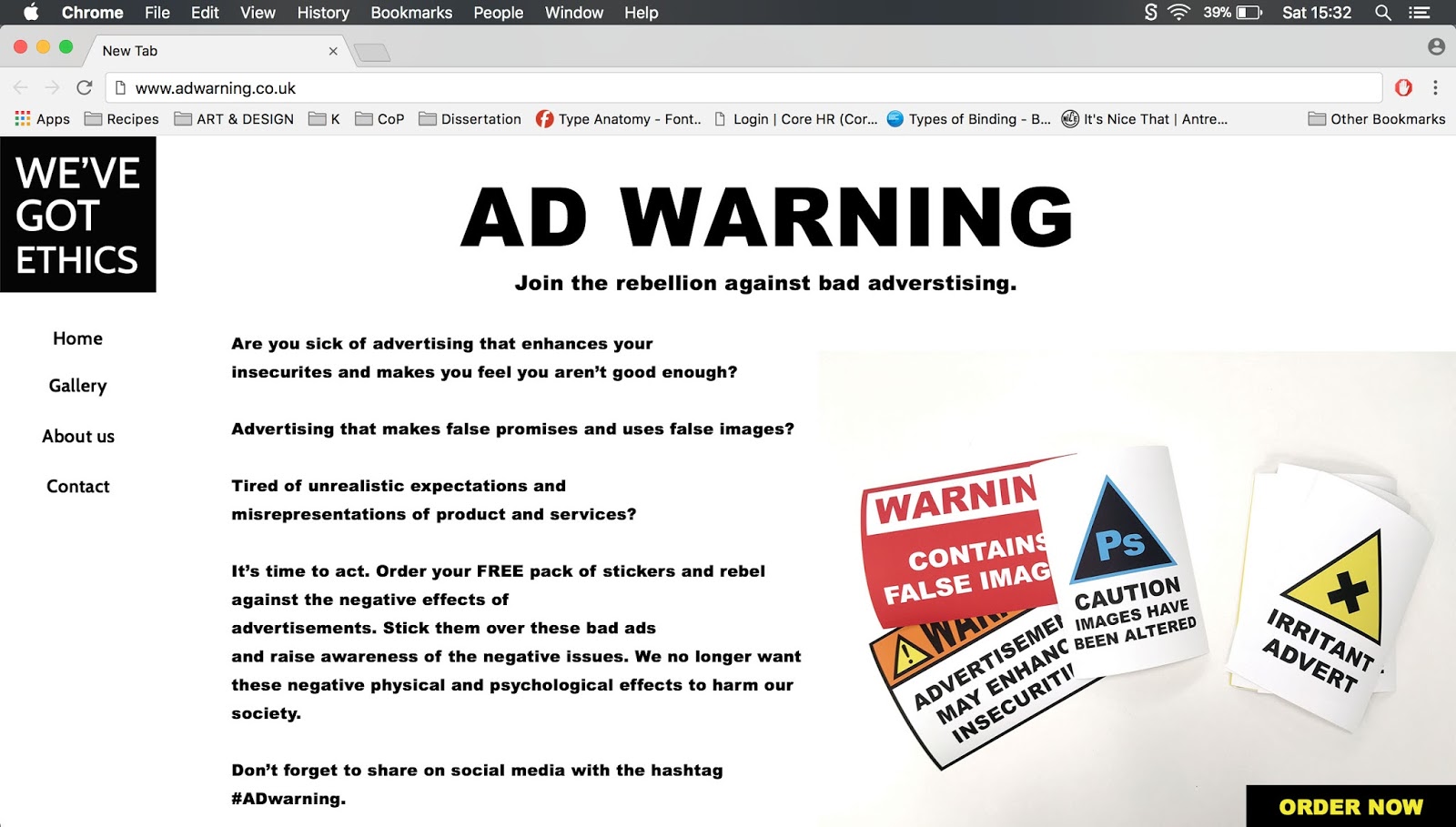
OUGD601 Practical Design (Webpage - Sticker order)
DESIGN
Webpage - Sticker order
As part of the campaign a website will be needed to inform people how to get involved and as a place from where they can order the stickers. The stickers will be provided free of charge as it will come under the campaign costs.
Mockup:

The landing page will give a brief overview of how people can take part and use the stickers. The 'About us' page will give more in depth details on what the campaign is trying to achieve and any further information regarding the issues. The Gallery page will include the posters from the campaign and any examples of the stickers being used.
Webpage - Sticker order
As part of the campaign a website will be needed to inform people how to get involved and as a place from where they can order the stickers. The stickers will be provided free of charge as it will come under the campaign costs.
Mockup:
The landing page will give a brief overview of how people can take part and use the stickers. The 'About us' page will give more in depth details on what the campaign is trying to achieve and any further information regarding the issues. The Gallery page will include the posters from the campaign and any examples of the stickers being used.
OUGD601 Synthesis between essay and practical
Synthesis
The relationship between the essay and the practical piece of work centres around forms of persuasive communication which influence behaviour. The practical concept is a form of guerrilla advertising which use more imaginative techniques, focusing on grasping the attention of the public in a more personal and memorable way. Within the essay I have mentioned how persuasion has become more complex within modern society, and new ways to target consumers are being utilised. Through extended research I have identified that guerrilla campaigns are an example of complex persuasion, as they use unconventional methods to persuade. Exploring the different methods of persuasion within the essay and the psychology behind why they work, helped me to develop further the possible negative effects that they could have within society.
Using the methods of persuasion that I have learnt about, I wanted to use them in a more positive light, to drive awareness to consumers of the possible negative effects that advertising can have. One of the methods I have mentioned within my essay is having a brand image which is established by a sharp contrast with what it is not, as well as 'tapping the pet hates of the target audience, so by bonding them with the advertiser by shared dislikes.' (O'Shaughnessy and O'Shaughnessy, 2004, p.79). I believe that the practical piece relates to this method as the campaign highlights clearly the negatives of advertisements and does so in an ironic way, using advertising to drive awareness of the negative effects of advertising. Consumers already have an awareness of some of these negatives, so by bonding over these issues it will encourage people to speak up and reject certain methods which lead to physical and psychological problems.
Another method mentioned within the essay is association related to a feeling of solidarity with others. The practical campaign concept encourages interaction by taking part in the 'rebellion', using the stickers and sharing it online. It hopes to join people together forming a movement of people rejecting negative advertising techniques. This in a way will provide group membership as anyone taking part will in turn be forming a group, which share the same beliefs and values regarding advertising. As more people see and take part in the campaign, this will act as social proof encouraging others to take part. By using 'real' people to promote the campaign it will make it appear more human and trustworthy, as identified within the essay this will make the audience more susceptible to the message.
The essay also explores association and how associating to a positive stimulus aids in persuasion. The practical concept is associated with humour and irony by using warning labels to promote awareness. This will increase the memorability of the campaign as well as the chance of people taking part. By using symbols and designs recognised within society as warnings, it symbolises authority. Which as discussed within the essay will make people more susceptible to the message, as well as making the campaign more noticeable. Symbols have been identified as a way of communicating as they substitute for direct information, that is why using this method and keeping the information clear and concise will help to establish and communicate the negative effects appropriately.
Overall the research within the essay has encouraged me to explore how I could use these persuasive methods ironically as a campaign of disruptive visual communication, to promote and drive awareness of the negative effects of advertising on society. I think that this practical exploration is important to show that persuasion can be used in different ways to influence. Having an awareness of the impact that these techniques have within society is crucial to limiting the negative effects. Together with the essay it provides a more thorough understanding of how persuasion works, why it works and what effect that can have.
Friday, January 19, 2018
OUGD601 Practical Design (Social media)
DESIGN
Social media:
The target audience range is between 16-25 and the best way to communicate to this audience in a digital age is through social media. An element of this campaign is to encourage viewers to take part and reject ads which promote harmful physical and psychological problems. By getting people to place stickers over negative advertisements it increases the awareness and communicates the message to a much wider audience. It helps people to understand the issues in a humorous way which will increase how memorable the campaign is. Overall it creates a louder voice to communicate the message and people will be able to interact and take part.
Instagram:

Through instagram people will be encouraged to use the stickers and place them over ads that they feel has a negative impact on society. Through the hashtag '#adwarning' people will be able to share their pictures of where they have placed the stickers.

Thursday, January 18, 2018
OUGD601 Practical Design (Posters in context)
DESIGN
Posters in context:


Posters in context:


These billboards will be put up in various locations such as:
- Bus stops
- Underground
- Shopping centres
- By main roads
- Train stations
- Public transport
Any area which is usually dominated by commercial advertising in the most public places, will be the most effective way to spread the campaign.
Wednesday, January 17, 2018
OUGD601 Practical Design (Final Posters)
DESIGN
Final Posters:


Based on the feedback that I received I decided to change the colour of the background to yellow and the symbol to black and white. This gave a more striking contrast and will capture attention from the brightness of the colour.

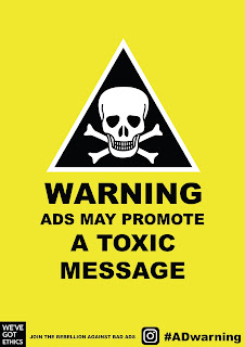


As I needed to keep the design in line with the others I decided to make it blue so that it has recognition with the photoshop symbol.

Overall I have kept the design simple and striking so that the information is communicated clearly and effectively. This helps people to clearly understand the negative effects of advertising. By using symbols which have authority, it helps to add a humorous tone as well as capturing attention.
Final Posters:


Based on the feedback that I received I decided to change the colour of the background to yellow and the symbol to black and white. This gave a more striking contrast and will capture attention from the brightness of the colour.


As I needed to keep the design in line with the others I decided to make it blue so that it has recognition with the photoshop symbol.

Overall I have kept the design simple and striking so that the information is communicated clearly and effectively. This helps people to clearly understand the negative effects of advertising. By using symbols which have authority, it helps to add a humorous tone as well as capturing attention.
OUGD601 Practical Design (Posters)
DESIGN
Posters:
As part of the brief the deliverables state posters, this is something that I will need to think about based on the campaign I am putting together. I want to keep the design in line with the warning label theme to provide cohesion across the campaign. However, I will need to include more information and make it more suitable for different contexts.
Design one

As I want to provide cohesion throughout the campaign and base the idea around warning labels I kept the same design as with the stickers. I made some slight edits to make it more appropriate as a poster such as changing 'ADVERTISEMENT' to 'ADVERTISEMENTS' as this is not being placed over an ad. At the bottom I have added the companies logo as per the requirements of the brief. I have also added the hashtag as this is a shareable social media campaign, the instagram logo helps to make it more clear where to search for this hashtag. I think that this design will work most appropriately on a billboard.
Feedback:
The feedback I received for this poster was positive, they liked the simplicity of the message and how it immediately grabs attention. It was suggested to add a strap-line at the bottom such as 'Join the revolution today', to encourage people to take notice and get involved.

Taking on board the feedback I added the line at the bottom 'JOIN THE REBELLION AGAINST BAD ADS'. I thought it was important to say bad ads as I want to make clear that this isn't an attack on all advertising, only when negative effects are involved. I also think adding the line at the bottom helps to fill up the white space and it looks like a more complete design.
Design two


To make this design more applicable to be a poster and to communicate the message clearly I added 'ADS MAY SHOW'. I tried out the design in a few different variations of the colour to see what effect that would have. I like the last design as it has a good colour contrast to grab attention, however I don't know whether to stick with the first design as that is more realistic.
Design three

I think this design works really well at standing out and grabbing attention. I've changed it from the sticker to make more sense as a poster.
Design four


For this design I added in 'AD MAY PROMOTE A' to make it a clear message. I've tried the design out in the two variations that I liked previously. I think I will need some feedback before I make my decision.
Design five

Design six

Design seven


Design eight

Design nine

Design ten

Design eleven

Feedback:
After showing the designs to my peers they really liked how simple and clearly the message is communicated within all of the designs. It is straight to the point, and isn't overcrowded with information. When talking through about changing the background colour on the triangle symbol posters, they felt that the yellow background did provide a higher contrast and looked more aesthetically pleasing. However, the design was said to still work well on the white background and provides cohesion with the stickers. Overall they liked the humorous nature of the campaign and using symbols of authority will capture attention.
OUGD601 Practical Design (Sticker setup for print)
DESIGN
Sticker setup for print:
To set the document up correctly to print stickers, I have created one layer with outlines 1.5 stroke width, of the shape that I want cut out. The design is then placed within the outlines on a separate layer. Each sticker will be A5 in size so as to be big enough to be noticed but not too big to make putting up the stickers hard.


Sunday, January 14, 2018
OUGD601 Essay (Bibliography)
ESSAY
Bibliography:
References
Jansson-Boyd, C. (2010). Consumer psychology. Maidenhead: Open University Press, pp.54-67.
Lury, G. (2001). Brandwatching. 2nd ed. Dublin: Blackhall, pp.1 - 75.
Poynor, R. (2007). Obey the giant. Basel: Birkhäuser.
O'Shaughnessy, J. and O'Shaughnessy, N. (2004). Persuasion in advertising. New York, N.Y.: Routledge.
Cannon, J., Baubeta, P. and Warner, I. (2000). Advertising and identity in Europe. Bristol: Intellect, pp.64-75.
Cialdini, R. (1993). Influence: The Psychology of Persuasion. New York: Collins.
Giddens, A. (1991). Modernity and Self-Identity. Cambridge: Polity Press, pp.2 - 198.
Ambrose, G. and Harris, P. (2011). Packaging the Brand: The Relationship Between Packaging Design and Brand Identity. 1st ed. Lausanne: AVA Publishing.
Papaneck, V. (1985). Design for the Real World: Human Ecology and Social Change. 2nd ed. Thames & Hudson.
Rawsthorn, A. (2013). Hello World: Where Design Meets Life. London: Hamish Hamilton, pp.49 - 72.
Perloff, R. (2003). The Dynamics of Persuasion: Communication and Attitudes in the 21st Century. 2nd ed. Mahwah, New Jersey: Lawrence Erlbaum Associates, pp.3 - 12.
Alistgator. (2012). Top 10 Controversial United Colors of Benetton Ads - Alistgator. [online] Available at: http://www.alistgator.com/top-ten-controversial-united-colors-of-benetton-ads/ [Accessed 27 Nov. 2017].
Benetton Controversial Advertisement. (1991). [image] Available at: http://www.alistgator.com/wp-content/uploads/2016/01/benetton-ad-1991.jpg [Accessed 27 Nov. 2017].
Heshmat, S. (2014). Basics of Identity. [online] Psychology Today. Available at: https://www.psychologytoday.com/blog/science-choice/201412/basics-identity [Accessed 28 Nov. 2017].
Gosling, S., Ko, S., Mannarelli, T. and Morris, M. (2002). A room with a cue: Personality judgments based on offices and bedrooms. Journal of Personality and Social Psychology, [online] 82(3), pp.379-398. Available at: http://citeseerx.ist.psu.edu/viewdoc/download?doi=10.1.1.612.5457&rep=rep1&type=pdf [Accessed 28 Nov. 2017].
Kelly, G. A. 1970: Perspectives in Personal Construct Theory. In Fransella, F. International Handbook of Personal Construct Psychology. Chichester: Wiley, pp. 3-20.
MullenLowe, Persil (2013). Still image from TV advert - 'For whatever life throws'. [image] Available at: https://creativepool.com/files/candidate/portfolio/full/569834.jpg [Accessed 2 Dec. 2017].
Y&R, Land Rover (2014). For everyone else theres the internet. [image] Available at: http://www.lebook.com/creative/everyone-else-theres-internet-advertising-2014 [Accessed 3 Dec. 2017].
Tajfel, H., & Turner, J. C. (1979). An Integrative Theory of Intergroup Conflict. In S. Worchel, & W. G. Austin (Eds.), The Social Psychology of Intergroup Relations (pp. 33-47). Monterey, CA: Brooks/Cole.
Festinger, L. (1954). A Theory of Social Comparison Processes. Human Relations, [online] 7(2), pp.117-140. Available at: http://www2.psych.ubc.ca/~schaller/528Readings/Festinger1954.pdf [Accessed 4 Dec. 2017].
Wills, T. (1981). Downward comparison principles in social psychology. Psychological Bulletin, [online] 90(2), pp.245-271. Available at: https://www.researchgate.net/publication/232505959_Downward_Comparison_Principles_in_Social_Psychology [Accessed 5 Dec. 2017].
Unilever, Ogilvy & Mather (2004). Will society ever accept 'old' can be beautiful?. [image] Available at: http://theinspirationroom.com/daily/2004/dove-campaign-for-real-beauty/ [Accessed 5 Dec. 2017].
McLeod, S. A. (2014). Classical Conditioning | Simply Psychology. [online] Simplypsychology.org. Available at: https://www.simplypsychology.org/classical-conditioning.html [Accessed 5 Dec. 2017].
Keller, K. (1993). Conceptualizing, Measuring, and Managing Customer-Based Brand Equity. Journal of Marketing, [online] 57(1), p.1. Available at: http://www.jstor.org/stable/1252054?origin=JSTOR-pdf&seq=1#page_scan_tab_contents [Accessed 6 Dec. 2017].
Ross, E. (1908). Social psychology, an outline and source book. [ebook] New York: The Macmillan Company, pp.30 - 31. Available at: https://archive.org/details/socialpsycholog01rossgoog [Accessed 6 Dec. 2017].
McCracken, G. (1989). Who is the Celebrity Endorser? Cultural Foundations of the Endorsement Process. Journal of Consumer Research, [online] 16(3), pp.310 - 321. Available at: http://www.jstor.org/stable/pdf/2489512.pdf [Accessed 6 Dec. 2017].
Milgram, S. (1963). Behavioral Study of obedience. The Journal of Abnormal and Social Psychology, [online] 67(4), pp.371-378. Available at: https://www.birdvilleschools.net/cms/lib/TX01000797/Centricity/Domain/1013/AP%20Psychology/milgram.pdf [Accessed 6 Dec. 2017].
McLeod, S. (2008). Hofling's Hospital Experiment of Obedience | Simply Psychology. [online] Simplypsychology.org. Available at: https://www.simplypsychology.org/hofling-obedience.html [Accessed 10 Dec. 2017].
Brown, S. and Turley, D. (1997). Consumer research. London: Routledge.
Nike (2012). Nike Launches "Find Your Greatness" Campaign. [online] Available at: https://news.nike.com/news/nike-launches-find-your-greatness-campaign-celebrating-inspiration-for-the-everyday-athlete [Accessed 10 Dec. 2017].
Nike, Wieden and Kennedy (2012). Greatness Isn't Determined By Judges. [image] Available at: http://www.sezayaltinok.com/find-your-greatness/ [Accessed 10 Dec. 2017].
Worchel, S., Lee, J. and Adewole, A. (1975). Effects of supply and demand on ratings of object value. Journal of Personality and Social Psychology, [online] 32(5), pp.906-914. Available at: http://citeseerx.ist.psu.edu/viewdoc/download?doi=10.1.1.822.9487&rep=rep1&type=pdf [Accessed 12 Dec. 2017].
Leigh, J. and Gabel, T. (1992). Symbolic Interactionism: Its Effects on Consumer Behaviour and Implications for Marketing Strategy. Journal of Services Marketing, [online] 9(1), pp.27-38. Available at: http://www.emeraldinsight.com/doi/abs/10.1108/EUM0000000002594 [Accessed 18 Dec. 2017].
Investopedia. (n.d.). Brand Personality. [online] Available at: https://www.investopedia.com/terms/b/brand-personality.asp [Accessed 22 Dec. 2017].
Solomon, M., Russell-Bennett, R. and Previte, J. (2013). Consumer behaviour. Frenchs Forest, N.S.W.: Pearson Australia.
Hirsh, J., Kang, S. and Bodenhausen, G. (2012). Personalized Persuasion. Psychological Science, [online] 23(6), pp.578-581. Available at: http://citeseerx.ist.psu.edu/viewdoc/download?doi=10.1.1.724.9023&rep=rep1&type=pdf [Accessed 29 Dec. 2017].
Goldberg, L. (1990). An alternative "description of personality": The Big-Five factor structure. Journal of Personality and Social Psychology, [online] 59(6), pp.1216-1229. Available at: http://citeseerx.ist.psu.edu/viewdoc/download?doi=10.1.1.455.8622&rep=rep1&type=pdf [Accessed 28 Dec. 2017].
Levy, S. (1959). Symbols for sale. Harvard Business Review, [online] 37(4), pp.117 - 124. Available at: https://www.uibk.ac.at/smt/marketing/brandresearchlab2/files/symbolsforsale_levy.pdf [Accessed 30 Dec. 2017].
Adage.com. (2003). Benetton. [online] Available at: http://adage.com/article/adage-encyclopedia/benetton/98948/ [Accessed 6 Jan. 2018].
Gorn, G. (1982). The Effects of Music in Advertising on Choice Behavior: A Classical Conditioning Approach. Journal of Marketing, [online] 46(1), p.94. Available at: http://www.jstor.org/stable/1251163 [Accessed 6 Jan. 2018].
Pollay, R. (1986). The Distorted Mirror: Reflections on the Unintended Consequences of Advertising. Journal of Marketing, [online] 50(2), p.18. Available at: http://www.jstor.org/stable/1251597 [Accessed 6 Jan. 2018].
Oralb.co.uk. (n.d.). Best Electric Toothbrush for You | Oral-B. [online] Available at: https://www.oralb.co.uk/en-gb/oral-b-institute/electric-toothbrush/best-electric-toothbrush [Accessed 13 Jan. 2018].
Coca-cola.co.uk. (n.d.). Share a Coke Names | Marketing Campaign | Coca-Cola GB. [online] Available at: http://www.coca-cola.co.uk/stories/share-a-coke# [Accessed 13 Jan. 2018].
OUGD601 Essay (Turnitin)
ESSAY
Turnitin:
I submitted my essay to turnitin to check my referencing and to make sure that nothing is plagiarised.

Overall I have a 12% similarity match which is good because it means that my work is my own and it hasn't been written before. Some of the matches were for things such as the header which is my name, or even from my own blog, as well as it not quite picking up the referencing properly. So, I am confident that I am referencing correctly and that the essay is my own work.
OUGD601 Practical Design (Sticker mockups with colour)
DESIGN
Sticker mockups with colour:
I want to keep the colours in line with warning labels to keep that sense of familiarity and connect it with an official/realistic warning so as to grab attention. From my research I have noticed colours which are commonly used, which include:
- Black (text and outlines)
- Yellow (background)
- Orange (background)
- Red (background)
- White (background)
The colours need to be bright, bold and vivid to attract attention.
Colour pallet:
Yellow (f1ea2f)

Orange (f57f20)

Black (000000)

Red (ec2524)

Design one


Looking at current colour combinations for this design the standard is to have the warning on an orange background, although there are variations on either a yellow symbol or orange. I think the yellow symbol works more effectively at grabbing attention and enhancing the 'warning'.
Design two


The symbol is usually kept a yellow colour, I think the background will work better on a white background however, it might work better as a poster on yellow.
Design three


I think the red stands out the most and will be able to quickly grab attention.
Design four


I think that the last colour combination with the filled in block skull makes it look more sinister and it stands out.
Design five

Yellow is usually associated with caution, and I think the black and yellow provide a high contrast which stands out.
Design six


I think that the first colour combination is the most effective as the red helps to highlight the 'Disclaimer'.
Design seven

Based on the toxic warning design I think that this is the most appropriate combination which works with the other design.
Design eight


I really like having the triangle in the same colours as the photoshop icon, this helps to keep it obvious what it is referencing and will make recognition easier.
Design nine


The first design works the most appropriately as it is in the same colours as the sign would be.
Design ten


Similar to the 'Disclaimer' I think the first design works the best at highlighting the importance.
Design eleven


The filled in shopping bag creates more of an impact.
Design twelve

This style is usually in black and white so I want to keep it the same to keep it as recognisable as possible.
Subscribe to:
Posts (Atom)