Posters:
As part of the brief the deliverables state posters, this is something that I will need to think about based on the campaign I am putting together. I want to keep the design in line with the warning label theme to provide cohesion across the campaign. However, I will need to include more information and make it more suitable for different contexts.
Design one

As I want to provide cohesion throughout the campaign and base the idea around warning labels I kept the same design as with the stickers. I made some slight edits to make it more appropriate as a poster such as changing 'ADVERTISEMENT' to 'ADVERTISEMENTS' as this is not being placed over an ad. At the bottom I have added the companies logo as per the requirements of the brief. I have also added the hashtag as this is a shareable social media campaign, the instagram logo helps to make it more clear where to search for this hashtag. I think that this design will work most appropriately on a billboard.
Feedback:
The feedback I received for this poster was positive, they liked the simplicity of the message and how it immediately grabs attention. It was suggested to add a strap-line at the bottom such as 'Join the revolution today', to encourage people to take notice and get involved.
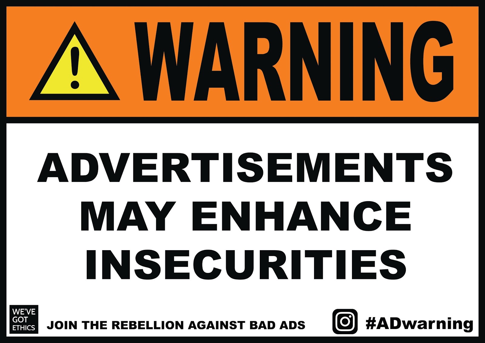
Taking on board the feedback I added the line at the bottom 'JOIN THE REBELLION AGAINST BAD ADS'. I thought it was important to say bad ads as I want to make clear that this isn't an attack on all advertising, only when negative effects are involved. I also think adding the line at the bottom helps to fill up the white space and it looks like a more complete design.
Design two


To make this design more applicable to be a poster and to communicate the message clearly I added 'ADS MAY SHOW'. I tried out the design in a few different variations of the colour to see what effect that would have. I like the last design as it has a good colour contrast to grab attention, however I don't know whether to stick with the first design as that is more realistic.
Design three

I think this design works really well at standing out and grabbing attention. I've changed it from the sticker to make more sense as a poster.
Design four


For this design I added in 'AD MAY PROMOTE A' to make it a clear message. I've tried the design out in the two variations that I liked previously. I think I will need some feedback before I make my decision.
Design five

Design six

Design seven


Design eight

Design nine

Design ten

Design eleven

Feedback:
After showing the designs to my peers they really liked how simple and clearly the message is communicated within all of the designs. It is straight to the point, and isn't overcrowded with information. When talking through about changing the background colour on the triangle symbol posters, they felt that the yellow background did provide a higher contrast and looked more aesthetically pleasing. However, the design was said to still work well on the white background and provides cohesion with the stickers. Overall they liked the humorous nature of the campaign and using symbols of authority will capture attention.
No comments:
Post a Comment