Reception:
I created a questionnaire which helped me to understand whether the new rebrand was successful, and if it has an impact on people's decision to buy the product.
Answers:
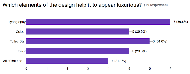
From this feedback it shows that generally people thought that the new design does help the product to look like a more high-end food product. It was noted that the use of white space provides a stripped back, simple and sophisticated design. Although some contradictory feedback felt there was too much black. The sans-serif typeface was thought by some to give off the high-end aesthetic and scored the most for the element that helps it to appear luxurious, whereas others felt it was too plain and reminded them of home brands, instead having a fancier font.
The results for whether people would consider buying this product based on the new packaging design show that it has the potential to influence some peoples decision, however it is not a definite that it has a full effect.
Lastly I received further feedback which could still further improve on the design to help it move into the high-end food market. This shows that the design could need further development before it is ready to be sold in shops. Based on this questionnaire I think that it will need further design development so that it has a better reception with the target audience.


No comments:
Post a Comment